Here we’ll be looking at a python library matplotlib which is used for plotting data in various ways. We’ll be detailing things such as iterating subplots, different grid specs, and complex labeling. We will not be covering all of the different types of plots that can be done, those can be found in the documentation here.
Import matplotlib
import matplotlib.pyplot as plt
Plot Sizing
The plot size can be defined in plt.subplots() as a keyword argument figsize=(X, y). The ax variable created will be used later.
fig, ax = plt.subplots(figsize=(10, 7))
fig, ax = plt.subplots(figsize=(1, .7))

Figure With Two Rows
We can also define a grid of different plots with plt.subplots() containing nrows, and ncols as keyword arguments. Notice how I change the ax variable to axes this is due to there now being multiple plots, more on that later.
fig, axes = plt.subplots(nrows=2)
Figure With Two Columns
Now we plot a figure with two columns.
fig, axes = plt.subplots(ncols=2)
Basic Plots
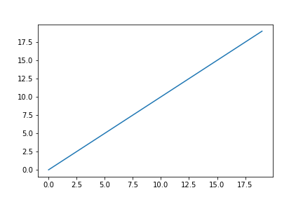
Now after showing how to create subplots we will look at plotting lines on an individual plot, and then we will move on to plotting on separate axes. There are many different plots that can be done with matplotlib, here are just a few examples before we dive into different methods. We’ll start by plotting a simple line.
X = list(range(0, 20))
y = X

plt.plot(X, y)
Ax Lines
Now we’ll take our line and add some ax lines on the x and y axis which are vertical and horizontal lines respectively. You’ll also notice a color argument, without it the lines would all be blue. C0 -> C9 are the default colors of matplotlib. When plotting with structured data matplotlib will sometimes use those default colors automatically.
plt.plot(X, y)

plt.axhline(10, color='C1')
plt.axvline(15, color='C2')
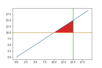
Filling Area
If we wanted to fill the center triangle created we can input x and y points of our polygon before calling plt.fill().
plt.plot(X, y)

plt.axhline(10, color='C1')
plt.axvline(15, color='C2')

plt.fill([10, 15, 15], [10, 15, 10], color='C3')

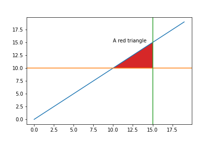
Annotation
Now let’s label the triangle as if it were something important.
plt.plot(X, y)

plt.axhline(10, color='C1')
plt.axvline(15, color='C2')

plt.fill([10, 15, 15], [10, 15, 10], color='C3')

plt.annotate("A red triangle", (10, 15))
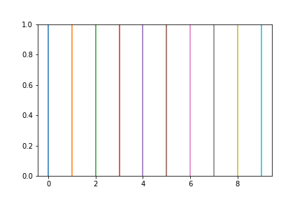
The Basic Color Scheme
Before moving back into the axes we will look at the default colors from matplotlib. I will simply iterate 0-9 and plot vertical lines at each x coordinate.
for x in range(10):
    plt.axvline(x, color=f"C{x}")
Plotting On Different Axes
Now we’ll start plotting on multiple axes. When plt.subplots() is called, two variables figure and axis are returned. The figure is “The top level container for all the plot elements.” (source: Figure documentation) An axis of the axes is the actual subplot or plot returned. For example with plt.subplots() a single ax is returned. With plt.subplots(nrows=2), ax becomes a list of two elements being the top and bottom axis.
fig, axes = plt.subplots(nrows=2)

axes
OUTPUT: (array([<AxesSubplot:>, <AxesSubplot:>], dtype=object), 2)
Grid Axes
To complicate things if we were to say there are two rows and two columns the length of axis would still be 2 as each row is an element in the list with elements pertaining to left and right. We could also say axes is a two dimensional array, with rows being the first dimension, and columns being the second.
fig, axes = plt.subplots(nrows=2, ncols=2)
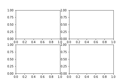
axes
OUTPUT: array([[<AxesSubplot:>, <AxesSubplot:>],
       [<AxesSubplot:>, <AxesSubplot:>]], dtype=object)
len(axes)
OUTPUT: 2
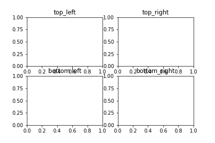
Iteratively Labeling a Grid
axes[0] is the first row, and axes[1] is the second. You may want to keep it this way if you are plotting similar data on each row, or you may call axes.flatten() to return a list going left to right -> top to bottom like so:
fig, axes = plt.subplots(nrows=2, ncols=2)
axes = axes.flatten()

names = ['top_left', 'top_right', 'bottom left', 'bottom_right']

for ax, name in zip(axes, names):
    ax.set_title(name)
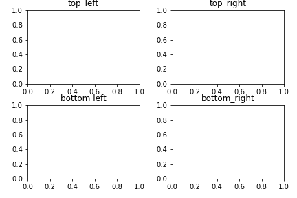
tight_layout
Notice how the Titles we set for the bottom two axes are overlapping the axis labels. To fix this we can call fig.tight_layout() which will make sure there is no overlap.
fig, axes = plt.subplots(nrows=2, ncols=2)
axes = axes.flatten()

# Tight Layout

fig.tight_layout()

names = ['top_left', 'top_right', 'bottom left', 'bottom_right']

for ax, name in zip(axes, names):
    ax.set_title(name)
Plotting Data
Now that you’ve seen how to plot and how to define a grid of axes let’s plot! We will start by importing a dataset with searborn.
from seaborn import load_dataset
df = load_dataset("titanic")
df.head()
| survived | pclass | sex | age | sibsp | parch | fare | embarked | class | who | adult_male | deck | embark_town | alive | alone | |
|---|---|---|---|---|---|---|---|---|---|---|---|---|---|---|---|
| 0 | 0 | 3 | male | 22.0 | 1 | 0 | 7.2500 | S | Third | man | True | NaN | Southampton | no | False |
| 1 | 1 | 1 | female | 38.0 | 1 | 0 | 71.2833 | C | First | woman | False | C | Cherbourg | yes | False |
| 2 | 1 | 3 | female | 26.0 | 0 | 0 | 7.9250 | S | Third | woman | False | NaN | Southampton | yes | True |
| 3 | 1 | 1 | female | 35.0 | 1 | 0 | 53.1000 | S | First | woman | False | C | Southampton | yes | False |
| 4 | 0 | 3 | male | 35.0 | 0 | 0 | 8.0500 | S | Third | man | True | NaN | Southampton | no | True |
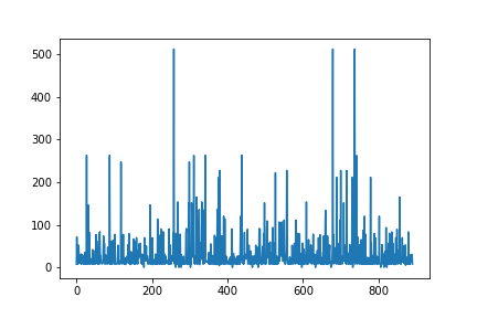
df is a pandas dataframe that we will use to plot data on different axes. If we want to use df as the data for plotting we simply say ax.plot(col, data=df) and feed in the columns we would like to plot as x and y strings for the plot method.
plt.plot('fare', data=df)
Plotting On Separate Axes
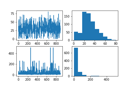
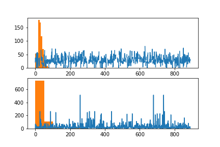
Now we will define a grid of four axis, and iterate over each row and label. On each row we will plot a line and histogram.
fig, axes = plt.subplots(nrows=2, ncols=2)

plot_cols = ['age', 'fare']

for col, axis_row in zip(plot_cols, axes):
    ax1 = axis_row[0]
    ax2 = axis_row[1]

    ax1.plot(col, data=df)
    ax2.hist(col, data=df)
Now before showing how to flatten the axes we will plot the bar and line on the same axis. There will only be two subplots of the following plot.
fig, axes = plt.subplots(nrows=2)

plot_cols = ['age', 'fare']

for col, ax in zip(plot_cols, axes):

    ax.plot(col, data=df)
    ax.hist(col, data=df)
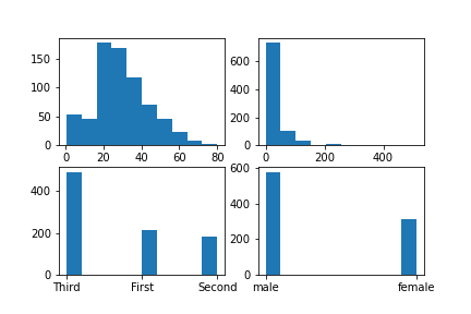
We could also use four different columns, and plot each one on a plot. We would do this by flattening the axes array before iterating over it.
fig, axes = plt.subplots(nrows=2, ncols=2)

axes = axes.flatten()

plot_cols = ['age', 'fare', 'class', 'sex']

for col, ax in zip(plot_cols, axes):
    ax.hist(col, data=df)
Using Grid Spec
I’ll start off by showing you the basic grid spec usage from matplotlib’s documentation. After that I will open the door for iteratively changing the grid spec.
# Using documentation style editing

import matplotlib.gridspec as gridspec

fig = plt.figure(constrained_layout=True)
spec = gridspec.GridSpec(ncols=2, nrows=2, figure=fig)
ax1 = fig.add_subplot(spec[0, 0])
ax2 = fig.add_subplot(spec[0, 1])
ax3 = fig.add_subplot(spec[1, :])
Now if we wanted to change the right row to be one plot we would change the ax2 spec to point to 1:0 (bottom left) and us the right side for the plot. The difference from the previous plot being where ax1 and ax2 are instantiated.
fig = plt.figure(constrained_layout=True)
spec = gridspec.GridSpec(ncols=2, nrows=2, figure=fig)
ax1 = fig.add_subplot(spec[0, 0])
ax2 = fig.add_subplot(spec[1, 0])
ax3 = fig.add_subplot(spec[:, 1])
Note at how we are using the colon to select the entire row or column. If you had a 5x5 grid or some other large size you may want to only select rows one and two to be a large plot in the middle as we will show here.
fig = plt.figure(constrained_layout=True)
spec = gridspec.GridSpec(ncols=5, nrows=5, figure=fig)

# Iterate the rows that will not be in the large plot

single_axis = [0, 3, 4]
for num in single_axis:

    # Iterate over each column of the row, and plot

    for i in range(5):
        ax = fig.add_subplot(spec[num, i])
        ax.plot(X, y)

# Slice out the spec of the large plot

mid_ax = fig.add_subplot(spec[1:3, :])
mid_ax.plot(X, y, color='C1')
Iteratively Creating a Grid
Now what if you wanted 3 rows, but only five plots where the final row was a single plot. First we create a 3x3 plot, and then remove the grid_spec already attached to the bottom axis. If we did not remove the axis we would be adding a plot onto other plots, and the default tick labels would show through. Our bottom indice is two so we will define a variable to use as this bottom indice.
fig, axes = plt.subplots(nrows=3, ncols=2)
fig.tight_layout()
bottom_indice = 2

gs = axes[0][0].get_gridspec()

for ax in axes[bottom_indice]:
    ax.remove()

for axes in axes[0: bottom_indice]:
    axes[0].plot(X, y)
    axes[1].plot(X, y, color='C1')

ax = fig.add_subplot(gs[bottom_indice, :])

ax.plot(X, y, color='C3')
This works the same way if you have more than two columns as well.
fig, axes = plt.subplots(nrows=3, ncols=3)
fig.tight_layout()
bottom_indice = 2

gs = axes[0][0].get_gridspec()

for ax in axes[bottom_indice]:
    ax.remove()

for axes in axes[0: bottom_indice]:
    axes[0].plot(X, y)
    axes[1].plot(X, y, color='C1')
    axes[2].plot(X, y, color='C2')

ax = fig.add_subplot(gs[bottom_indice, :])

ax.plot(X, y, color='C3')
Labeling
Now that we’ve talked over some basic methods of plotting, how do you label them? We’ll go over that next starting with a single plot’s title then moving onto iteratively titling each axis.
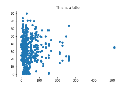
plt.scatter(x='fare', y='age', data=df)

plt.title("This is a title")

Note that the methods for changing labels on an axis are different for example: plt.title() vs ax.set_title(). I recommend becoming familiar with the axis labeling techniques as those will be used more often, and can be used for any plot, vs the plt commands can only be used with a single subplot.
fig, ax = plt.subplots()

ax.scatter(x='fare', y='age', data=df)

ax.set_title("This is a title")
There are also default parameters you can set found Here in the documentation
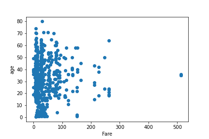
Now if we wanted to label the x and y axis, we use ax.set_xlabel() and ax.set_ylabel()
fig, ax = plt.subplots()

ax.scatter(x='fare', y='age', data=df)

ax.set_xlabel("Fare")
ax.set_ylabel("age")
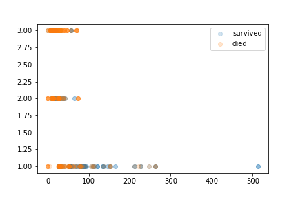
Now if we wanted to plot multiple datasets on one plot we may want to have a legend. We do this by calling ax.legend() and setting the labels for each axis as we plot. We’ll start by splitting out whether or not someone survived, and then after that plot each of the survived and died datasets.
# Separating survived from died

survived_df = df.loc[df['survived'] == 1]
died_df = df.loc[df['survived'] == 0]

fig, ax = plt.subplots()

# Setting an opacity variable for how transparent the points are

opacity=.2

ax.scatter(x='fare', y='pclass', data=survived_df, label='survived',
           alpha=opacity)

ax.scatter(x='fare', y='pclass', data=died_df, label='died',
           alpha=opacity)

ax.legend()
There is much more to matplotlib that you can find in the Documentation. I also recommend checking out seaborn. Let me know on linkedin if you want any specific blog posts or have questions about a post!